 |
| White marble tombstone covered with black lichen. |
Tuesday, June 21, 2011
Tuesday, June 14, 2011
INK TO PAPER
I was gathering up printed materials for clients over the passed year and decided to post it all as one. After working in the digital ether for most of my days, it's a welcome change when a client comes to me with a print project. Seeing the ink on paper and holding the finished product in our hands lets us experience how our designs fit in the physical world.
I have more print jobs happening at the moment, but hopefully it won't be another year before they see themselves featured in the halls of CFC.
Client: Green Room
Project: Thank You Cards
Printer: GreenerPrinter
Dimensions: 2.5 x 2.5 inches
Client: Reverend Catherine Paretti
Project: Business Card
Printer: PrintingForLess
Dimensions: 2.5 x 3 inches
Client: M. Sutherland Fine Arts, Ltd
Project: Gallery show and opening invite
Printer: PrintingForLess
Dimensions: 5 x 7 inches
Client: Island Endodontics
Project: Log design, stationary and business cards
Printer: GreenerPrinter
Dimensions: 3 x 2.5 inches, 8.5 x 11 inches, #10 envelope
Friday, June 10, 2011
GRAYSCALE
 |
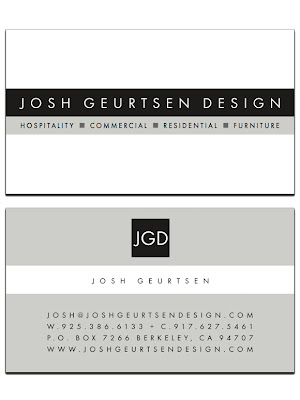
| The business card. |
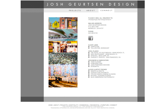
I recently had the pleasure and opportunity to work with a former colleague again, Josh Geurtsen, on his new logo, website and business cards. Josh, a licensed Interior Designer, and I worked together at TODD OLDHAM STUDIO for about 11 years. Although we shared the same office space for several years, we never really got to collaborate much until Todd had his Todd Oldham by La-Z-Boy collection. Josh would work on the actual furniture frames and styles while I myself focused on the textiles and accessories.
In early 2010, Josh and his family bid a fond farewell to NYC and relocated to the San Francisco Bay area. The formation of JOSH GEURTSEN DESIGN in May 2010 marked the beginning of a new phase in his lifelong pursuit of creating and transforming spaces that are unique in character and harmonious with the world around them.
Up next is another gallery site for a good friend and several new logos... stay tuned.
Tuesday, June 07, 2011
Sunday, June 05, 2011
Subscribe to:
Posts (Atom)


